
Crocodile Girl – Sam Omatseye
Dear book lovers, we have unboxed 5 books from Parresia publishers, so we are starting to talk about the book covers of all the five books one after the other.
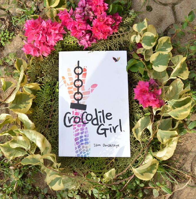
The first in line is the Crocodile Girl by Sam Omatseye.
Our analysis is based on major components as:
1. Cover feel:
The cover is smooth, smooth as bottle or a Television screen. You feel peace when you run your fingers across.
The cover is smooth, smooth as bottle or a Television screen. You feel peace when you run your fingers across.
2. Text design
The text : Crocodile Girl could have been more beautiful if justified, as in, placed right in the middle. The font of the title and author’s name are same, which is fine. I understand the font was also on purpose, but the text balance isn’t that amazing.
The text : Crocodile Girl could have been more beautiful if justified, as in, placed right in the middle. The font of the title and author’s name are same, which is fine. I understand the font was also on purpose, but the text balance isn’t that amazing.
An amazing thing was the thickness you feel when you touch the text, the title text. You could close your eyes and run your fingers and find out the text was “Crocodile Girl” without being told.
3. Art:
The art on the cover is something abstract. A slavery symbol if you look closely. A colored ✋ hand raised as though it were saying : “STOP”. The title text went across the art, which was partially not in order. Would have liked itself if it stood alone without any text encroachment.
The art on the cover is something abstract. A slavery symbol if you look closely. A colored ✋ hand raised as though it were saying : “STOP”. The title text went across the art, which was partially not in order. Would have liked itself if it stood alone without any text encroachment.
4. Layout balance:
The total layout balance of the cover would have a 5 over 10. The spaces are numerous and the absence of a cover blurb made the entire layout more empty and too plain.
The total layout balance of the cover would have a 5 over 10. The spaces are numerous and the absence of a cover blurb made the entire layout more empty and too plain.
5. Color combination:
Colors used are simple. More white, black texting, blue, purple, yellow, light red.
Colors used are simple. More white, black texting, blue, purple, yellow, light red.
6. Resistance to dust:
Yes. It is cleanable. Smooth and ready to resist dirt or dust. You can also wipe dirt off the cover with a wet towel and it comes back to new again.
Yes. It is cleanable. Smooth and ready to resist dirt or dust. You can also wipe dirt off the cover with a wet towel and it comes back to new again.